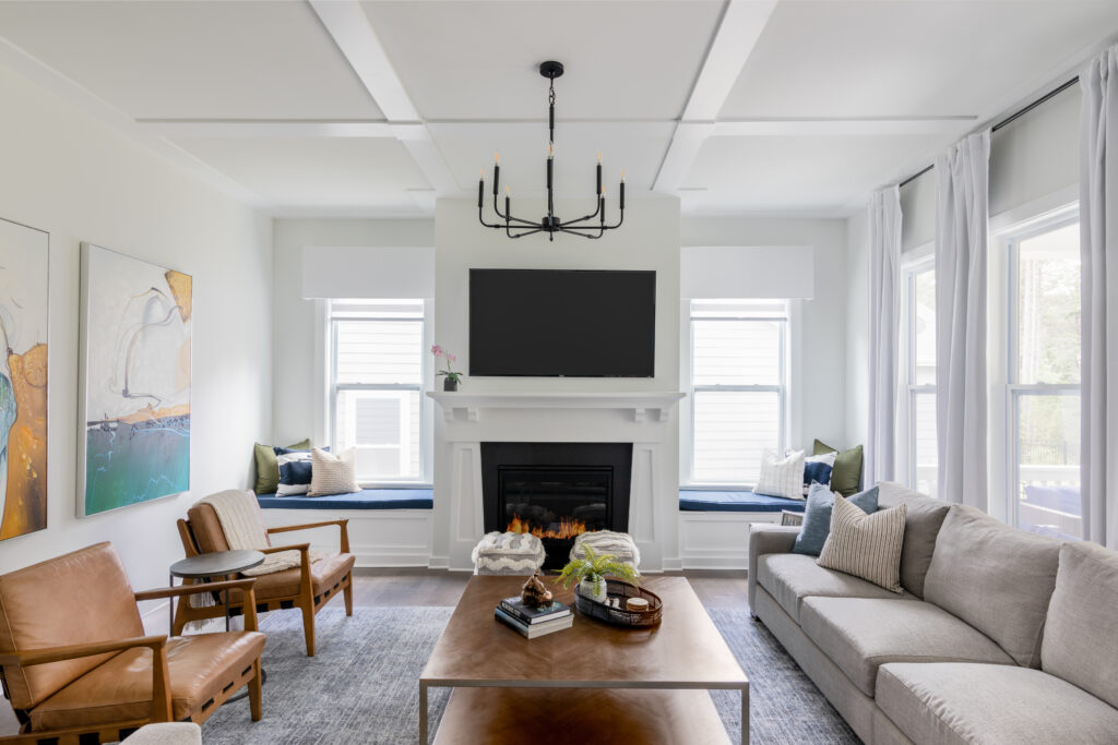
Architecture and Real Estate photography can be very picky when it comes to angles and views. It’s not just that there are tons of settings and details to get right (there are but not that’s not the point) it’s that the slightest adjustment to camera position can make such a huge difference when it comes to compositions.
I realize that a lot of times different compositions are used to achieve different goals so lets take a look at the topic of viewing angles and when to shoot from the corner of a room vs straight on.
Shooting from a Corner
In Real Estate especially, shooting from the corner of a room is extremely common. Every reason really falls behind one purpose, to show as much of the space as possible. The fact of the matter is, if you want to see multiple walls, the floor and the ceiling, you’re probably going to be shooting from the corner.
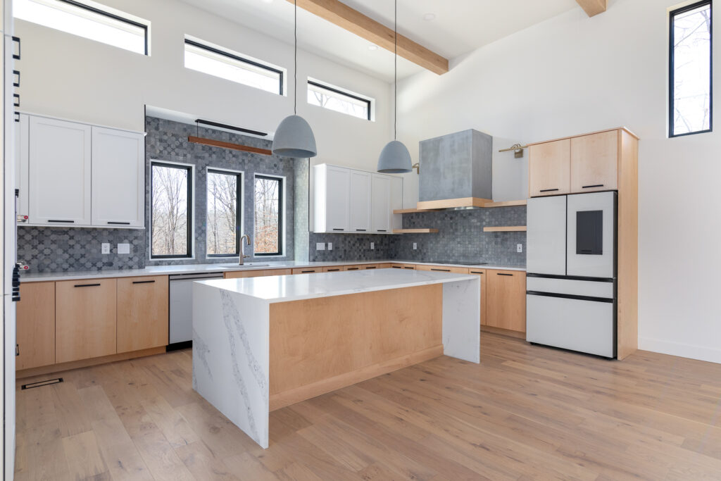
Shooting this way can make the room feel larger. Simple geometry explains that the amount of distance from one corner to the opposite corner is longer than one wall to the other. So you really are capturing more of the room in your shot. You can usually see furniture layouts better this way and include details like doors and window locations without them dominating the scene.
Corner shots also allow you to work around elements of the room easier. You can usually avoid a large piece of furniture in the foreground by shooting from a corner. You can avoid a lot of glare from the windows as well because you don’t have to shoot directly into a window. For these reasons, most of your Real Estate photos will be corner shots. They do a great job at showcasing a space efficiently and effectively.
Shooting Straight On
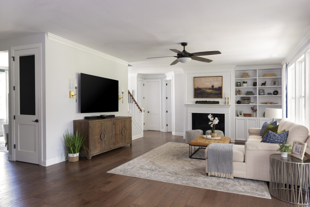
There are plenty of cases where you’ll want to shoot straight on though. In general, many people agree that a photograph shot head on can feel more luxurious and designed. There is just something about symmetry that makes us feel fancy! Shooting straight on is the perfect solution when you are trying to feature a specific object in an image like a fireplace or a kitchen island. The key though is making sure that you have enough space to back away from the object. I personally shoot straight on as much as I can, as long as the photo still tells the story of the room.
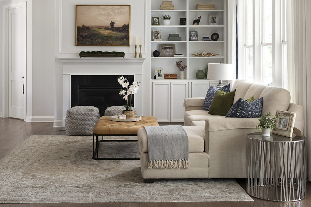
This is where the decision can get a little trickier. It really boils down to your goals with the image. If you are photographing for a designer or builder, then absolutely, get straight on, when possible. Feature those design details that are going to show off your client’s skills. But if you’re photographing to sell a property, you’ll want to make sure you have additional images that will show the space. Buyers will love seeing fancy details in a room, but they do need to see the rest of the space as well. If photo numbers are limited, a corner shot may still yield the best results and it does a seller no good to feature a pretty wall but not show how the wall connects to another room. If I’m being completely honest, my company shoots angles for over 90% of our real estate photos.
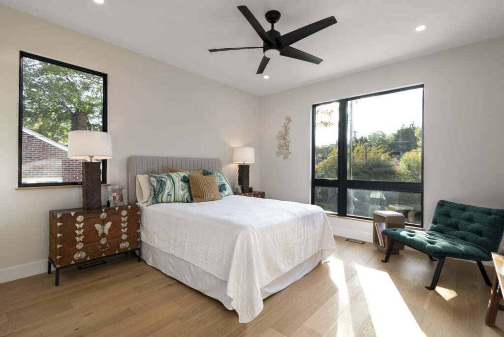
As much as I love a good straight on shot (especially if I have enough space to use a 50mm lens) it is super important to consider that shooting super wide can actually give the room a “tunnel effect” which usually misrepresents the space. So if you have to shoot wide on a straight on, try to keep your focal length no less than 24mm
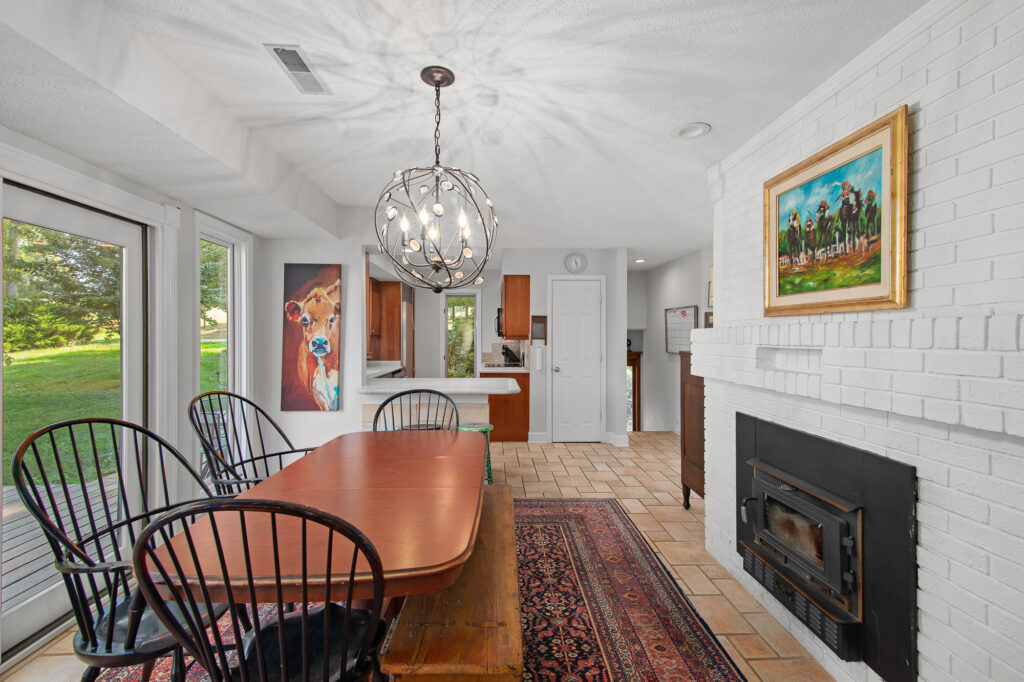
At the end of the day, you can always capture both and decide later which shot does the trick. The decision isn’t the most difficult, though it is still important. Just keep in mind what your end goal is and use that to make your decision!
PS: If your tired of showing up to a listing and having to straighten up before getting started, try giving your agents this Seller’s Checklist to Prepare for Photography. It’s the exact list I give my agents!
Read More: 3 Easy ways to prep a home for photography